I · 1 The thesis
A logo condenses a brand. Typography constructs it. My designer did not start with a logo. She started with the voice.
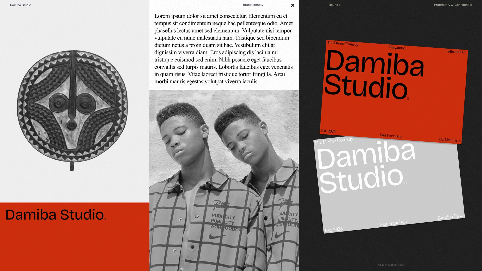
A logo may appear once. The type appears everywhere: headlines, labels, packaging, receipts, product pages, emails, garment tags. It has more surface area than anything else.
The brief
DAMIBA takes the visual language of East Coast prep and freaks it through West African craft, Black style, and canonical literature. The first collection begins with Dante's Purgatorio.
Decide how the brand speaks before you draw anything. The voice comes first.
Give the voice an atmosphere, found where Dante, Burkina Faso, and pigment already meet.
Compress every decision already made into a single mark. The symbol comes last.
A logo condenses a brand. Typography constructs it. My designer did not start with a logo. She started with the voice.
Designed in San Francisco. Made in Burkina Faso. The brand has to hold a lot at once:
boarding school and OuagadougouDante and contemporary fashionold institutions and new authorshipinheritance and rebellion
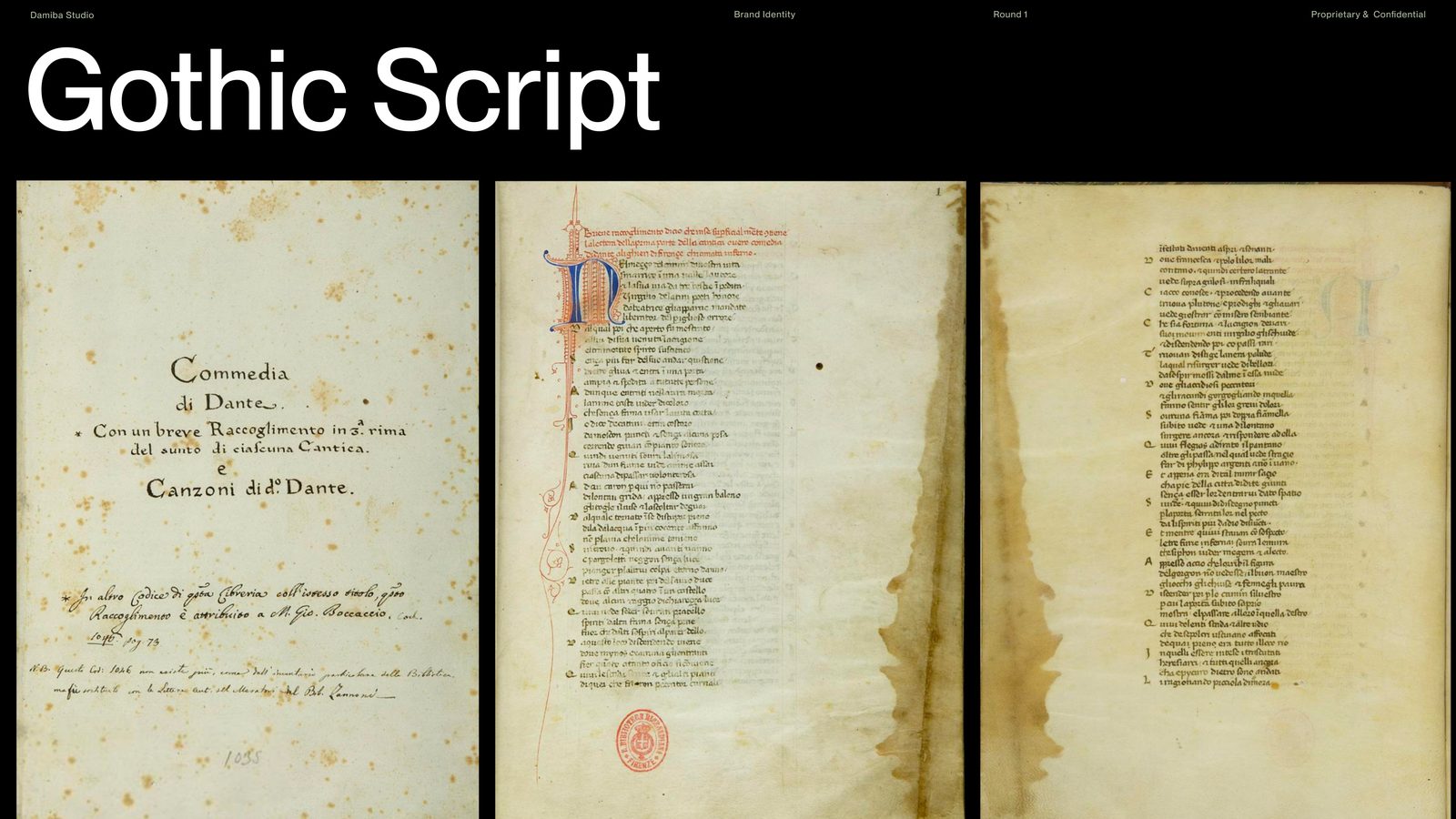
We began with The Divine Comedy itself. The earliest manuscripts were written in Gothic scripts: dense, vertical, sacred, severe. Beautiful, but too literal. The source had to be felt, not reproduced. I did not want DAMIBA to feel like medieval cosplay.
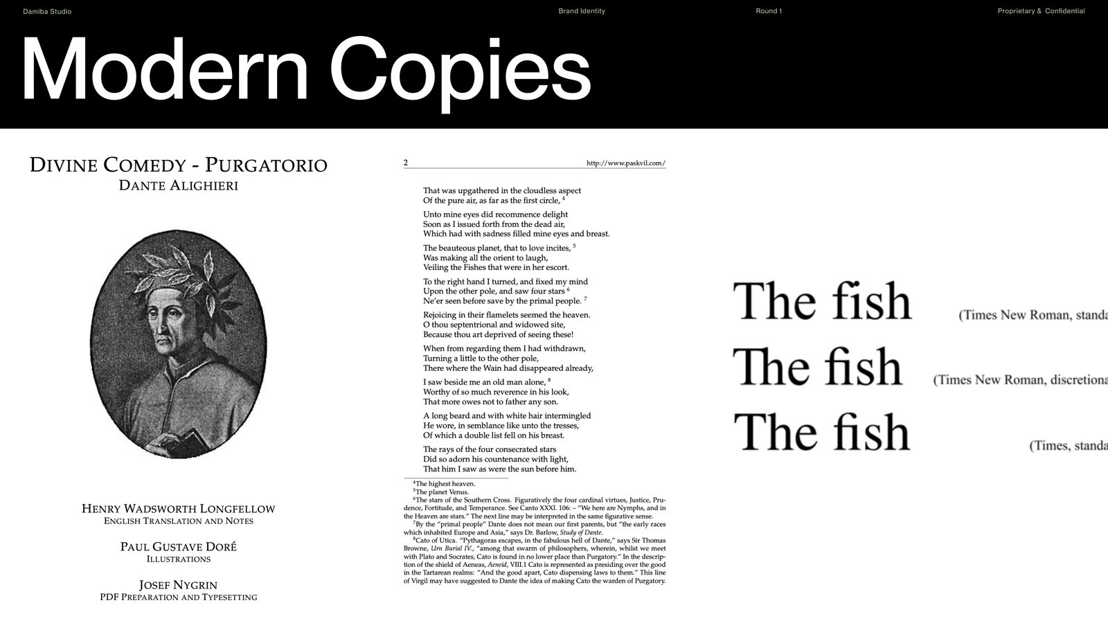
Gothic blackletter gave us the sacred register, but reproduced directly it read as costume. We kept the severity and let the letterforms go.
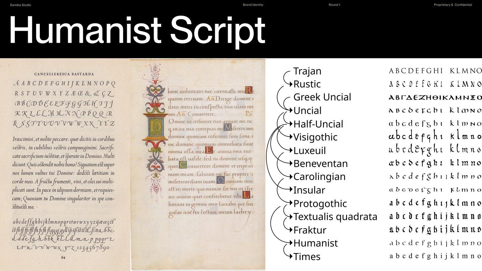
From there the research moved into humanist script and the serif tradition that followed it. That gave us the literary side of the brand:
editorialhistoricalcanonicalslightly institutional
The world of books, schools, museums, and inherited authority.
I did not want DAMIBA's African identity to come from a pattern pasted onto a European object. It needed to live deeper, inside the structure of the letters themselves.
So the second search was for type shaped by West African visual culture: Touki Grotesk, Kigelia, OS Gagnoa. Not decoration applied on top, but structure to build from.
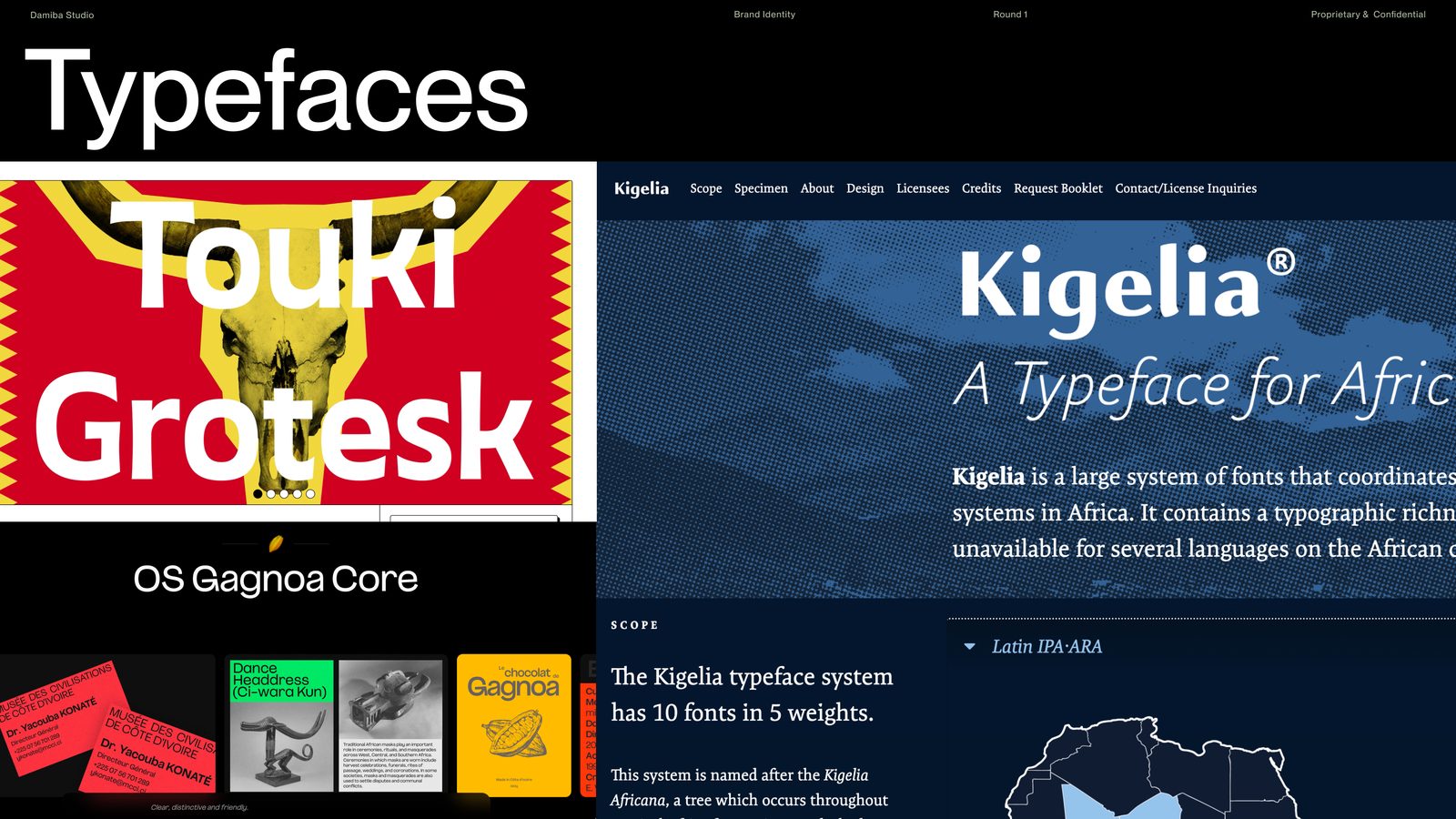
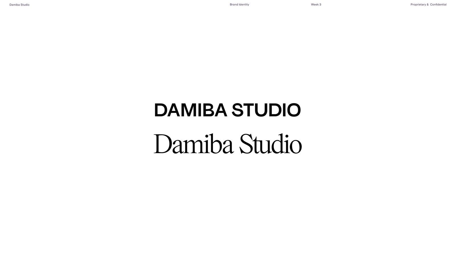
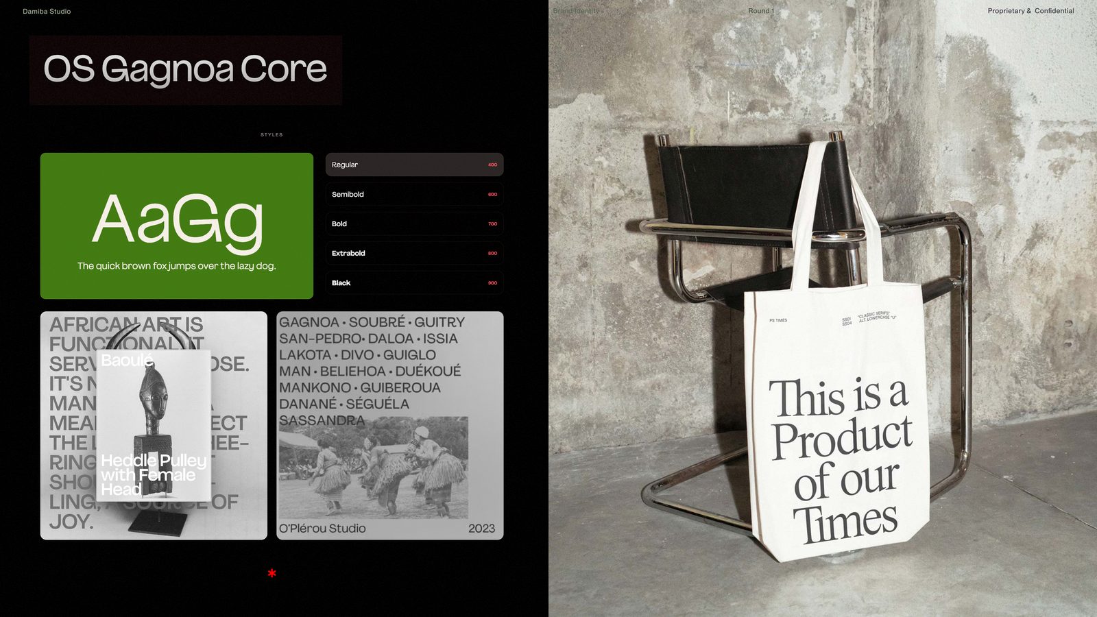
The final identity paired OS Gagnoa Core with PS Times. Gagnoa is a contemporary grotesque shaped by West African visual culture. PS Times reimagines the institutional serif with more tension and personality. One carries place. The other carries the canon.
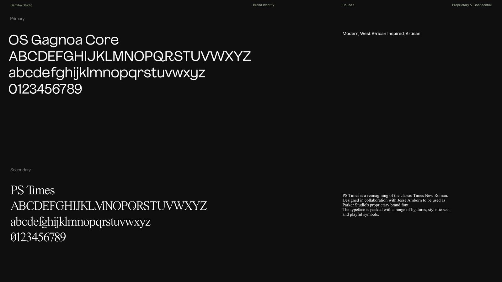
That solved the problem I cared about. The African identity of DAMIBA is not added afterward as print or decoration. It is inside the typography itself, built into the part of the brand people see most.
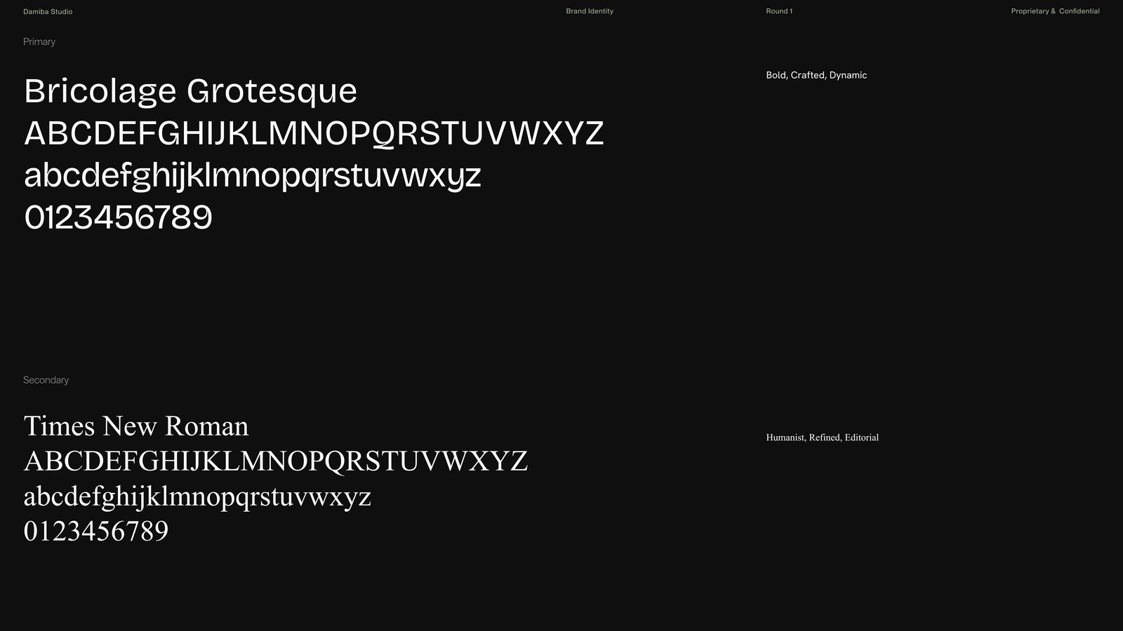
We also chose a more accessible alternative: Bricolage Grotesque and Times New Roman. Same relationship: a contemporary grotesque beside an inherited serif. But that pairing is the fallback, not the identity itself.
A logo condenses a brand. Typography constructs it. First you decide how the brand speaks; only then do you reduce the whole world into a symbol.
We did not start by choosing a red. We started by asking: which red? If typography gave DAMIBA its voice, color had to give it atmosphere, and that atmosphere had to hold Dante, Burkina Faso, literary history, material craft, luxury, and severity at once.
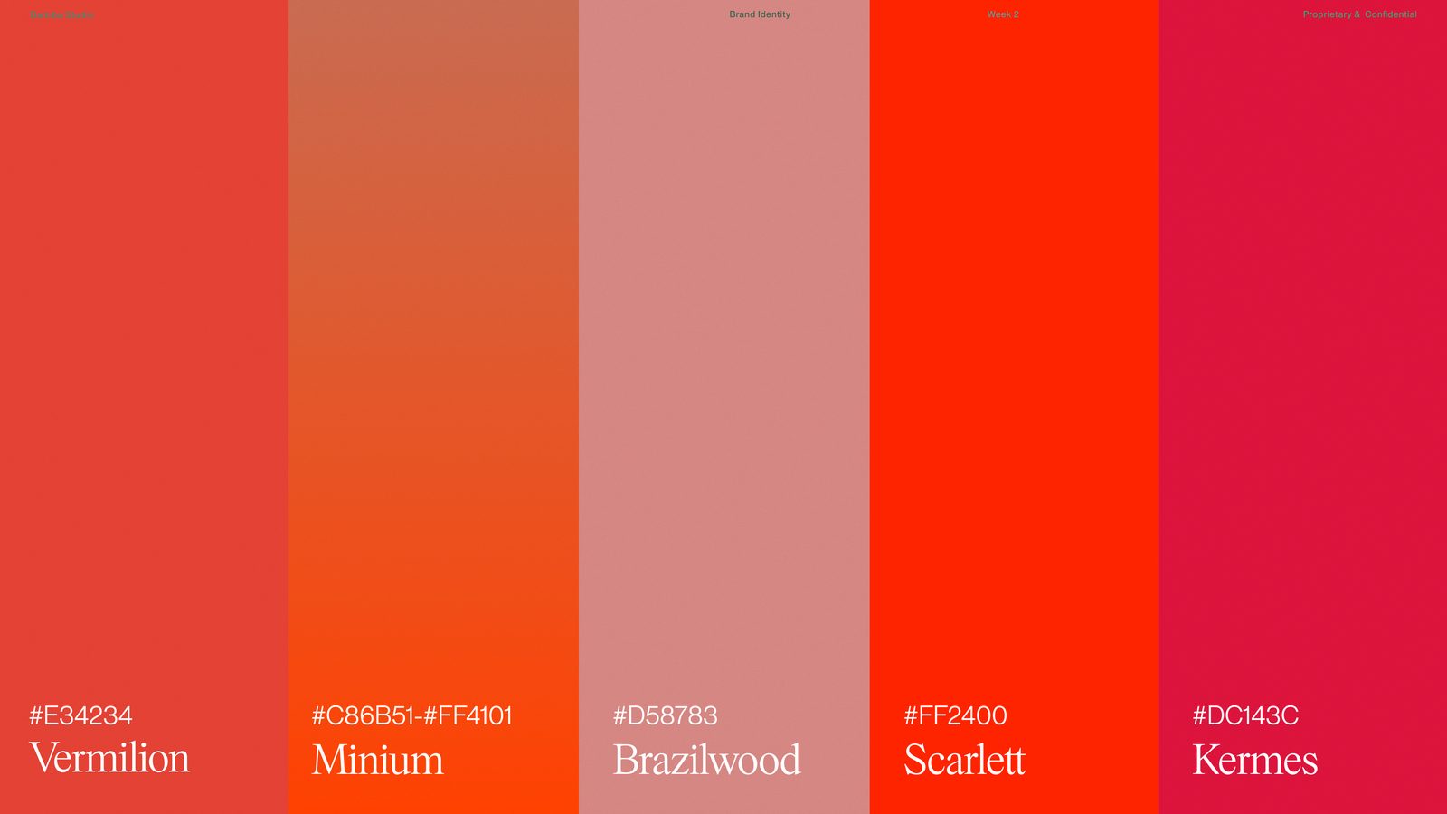
Instead of a random brand red, we looked at the historical reds around the world DAMIBA comes from, and at the paintings the source lives in. Red was already everywhere in Dante: in robes, bindings, seals, marginal ornament.
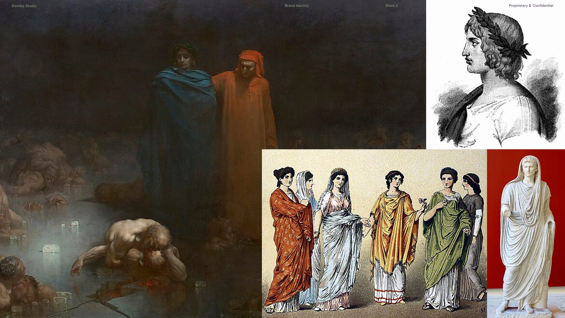
Vermilion. Minium. Brazilwood. Scarlet. Kermes. Not just colors: pigments, materials, and histories. Color as matter before it was ever a swatch:
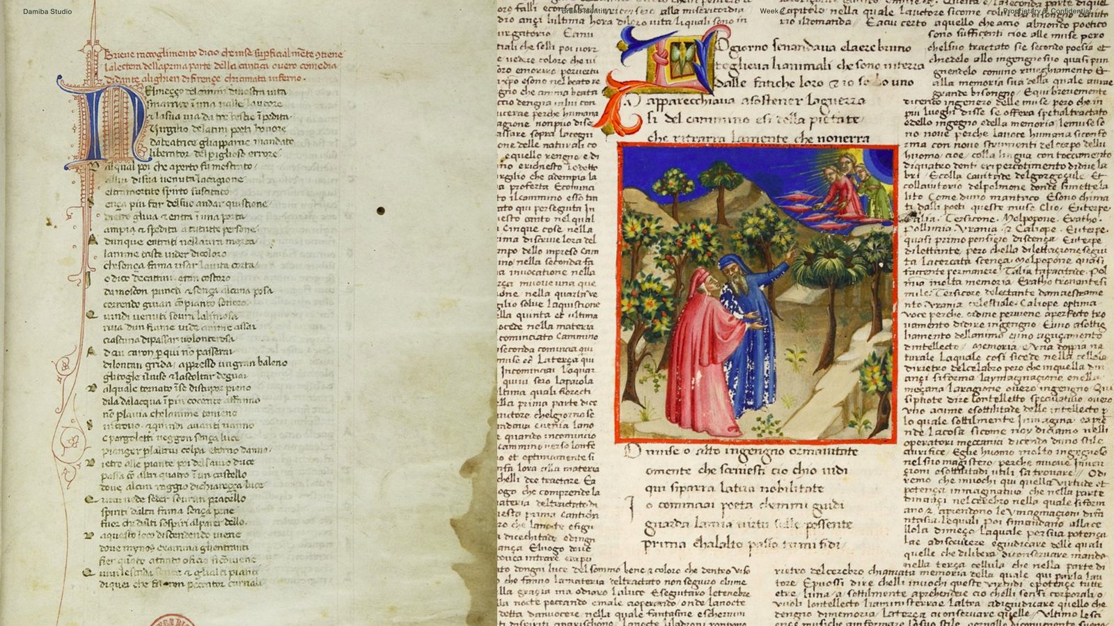
In illuminated manuscripts the literary side of DAMIBA was already speaking in red: rubrication, initials, the marked and the sacred. This page borrows that grammar.
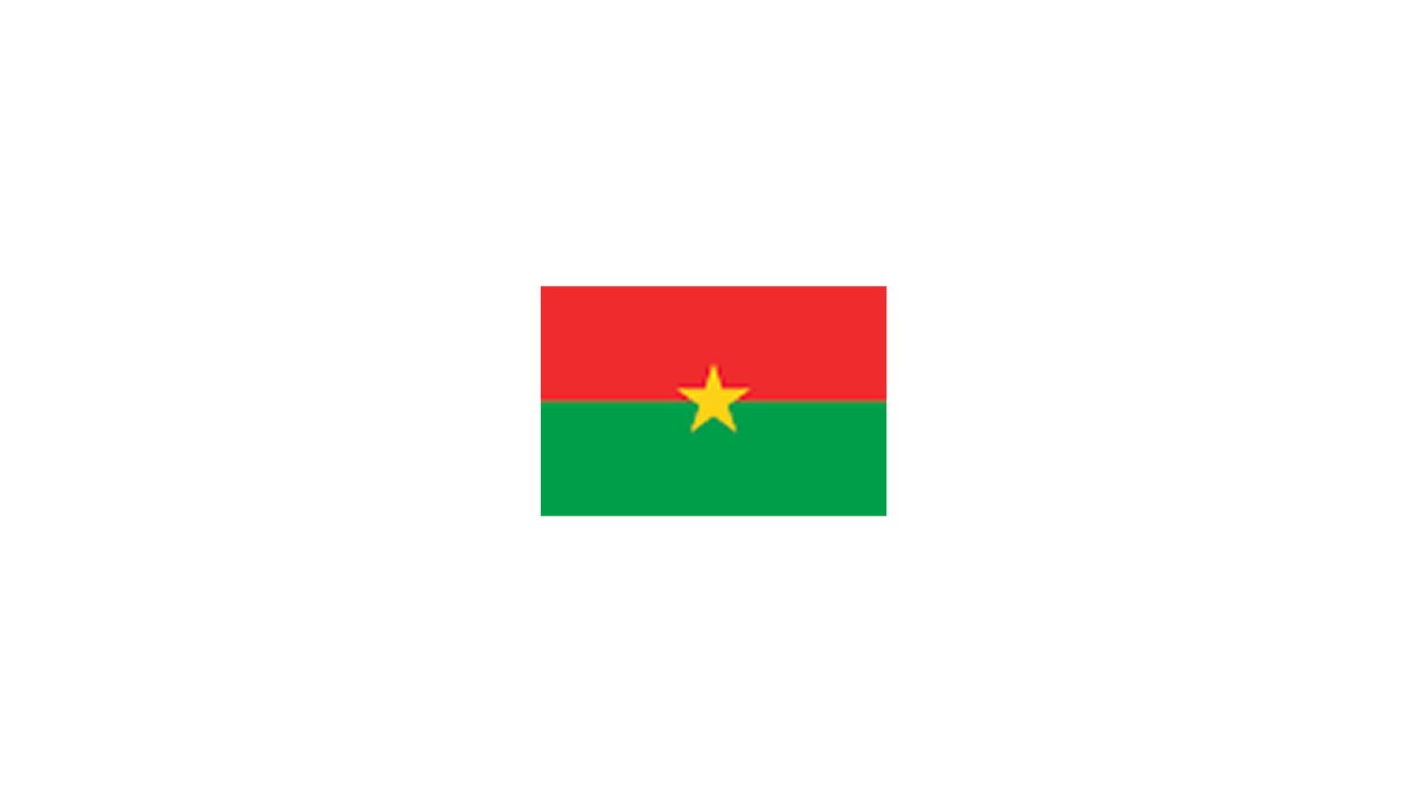
Red was present on the Burkinabè side too. But I did not want a simplistic "use the flag colors" move. The goal was not citation. It was recurrence: colors that kept appearing across all the worlds the brand comes from.
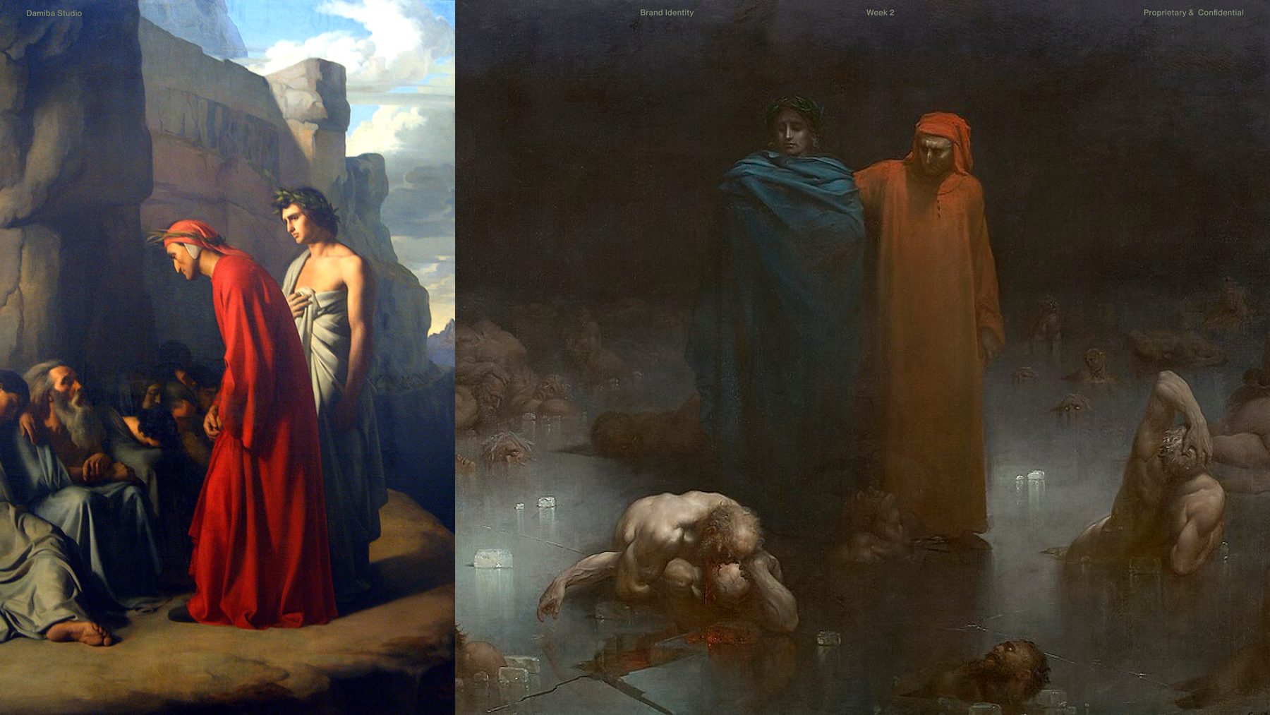
Red leads. Black and almost-white stabilize it. Blue appears sparingly, a controlled accent from the contrast between Dante and Virgil, bringing something old-world and institutional. Less heat. More authority.
The blue mattered because it gave the system another register. It came from the Dante paintings, especially the contrast between Dante and Virgil, and brought in something more institutional and old-world.
Then the broader application palette: cream, grey, earth, green. Not co-equal brand colors. Supporting colors. Material colors. Garment colors. The permanent identity still rests on red, black, and almost-white.
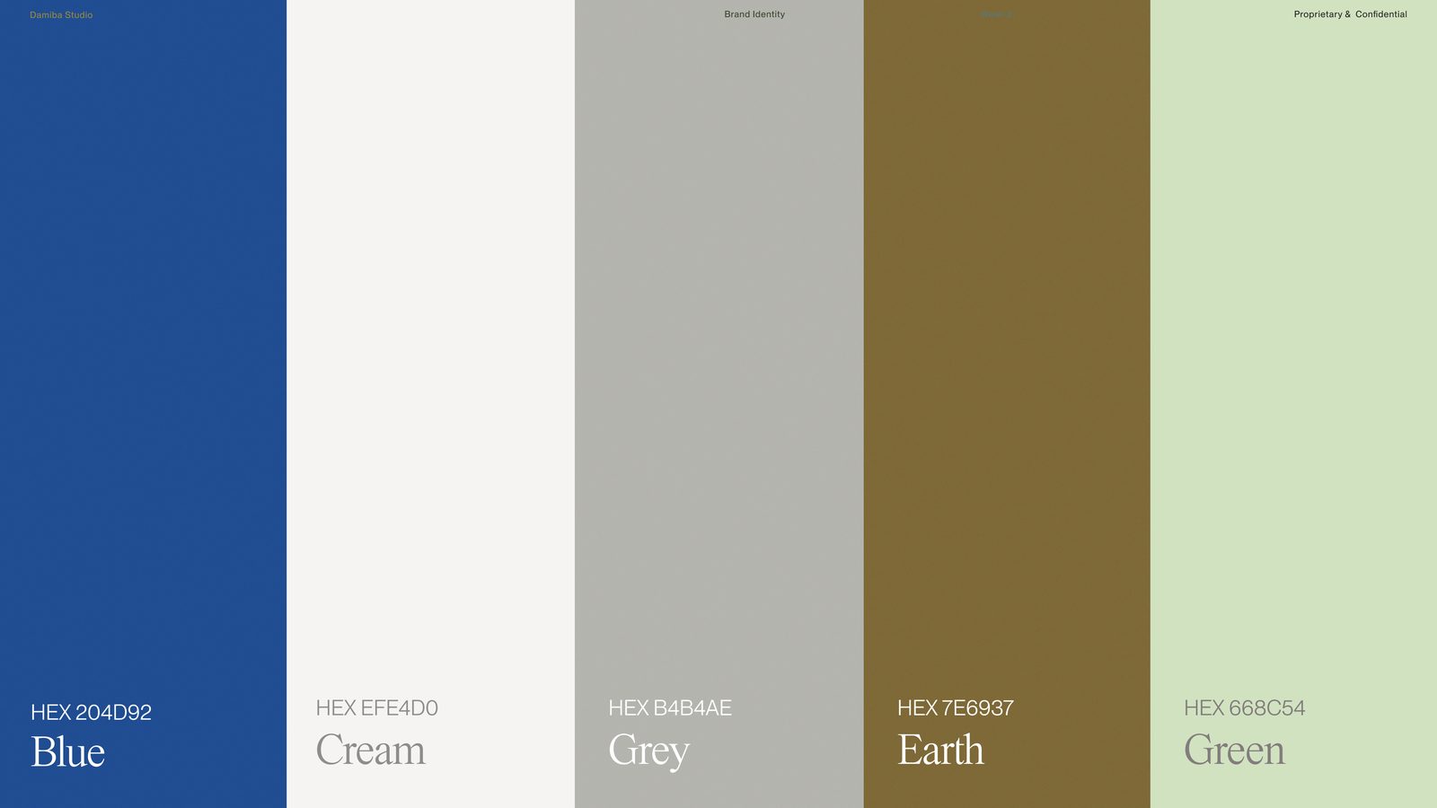
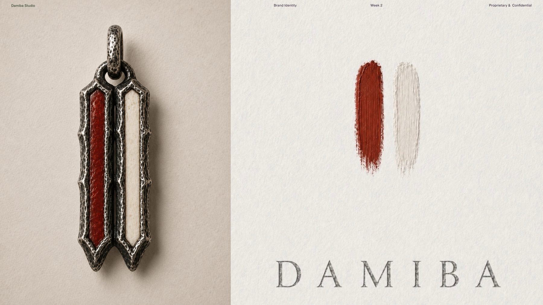
DAMIBA's red was not picked from a color wheel. It was found where Dante, Burkina Faso, manuscript pigment, and material craft were already meeting.
By week three the logo was almost the easiest part. The real work had already happened in typography and color. The brand had a voice, an atmosphere, a set of tensions. The logo just had to compress them.
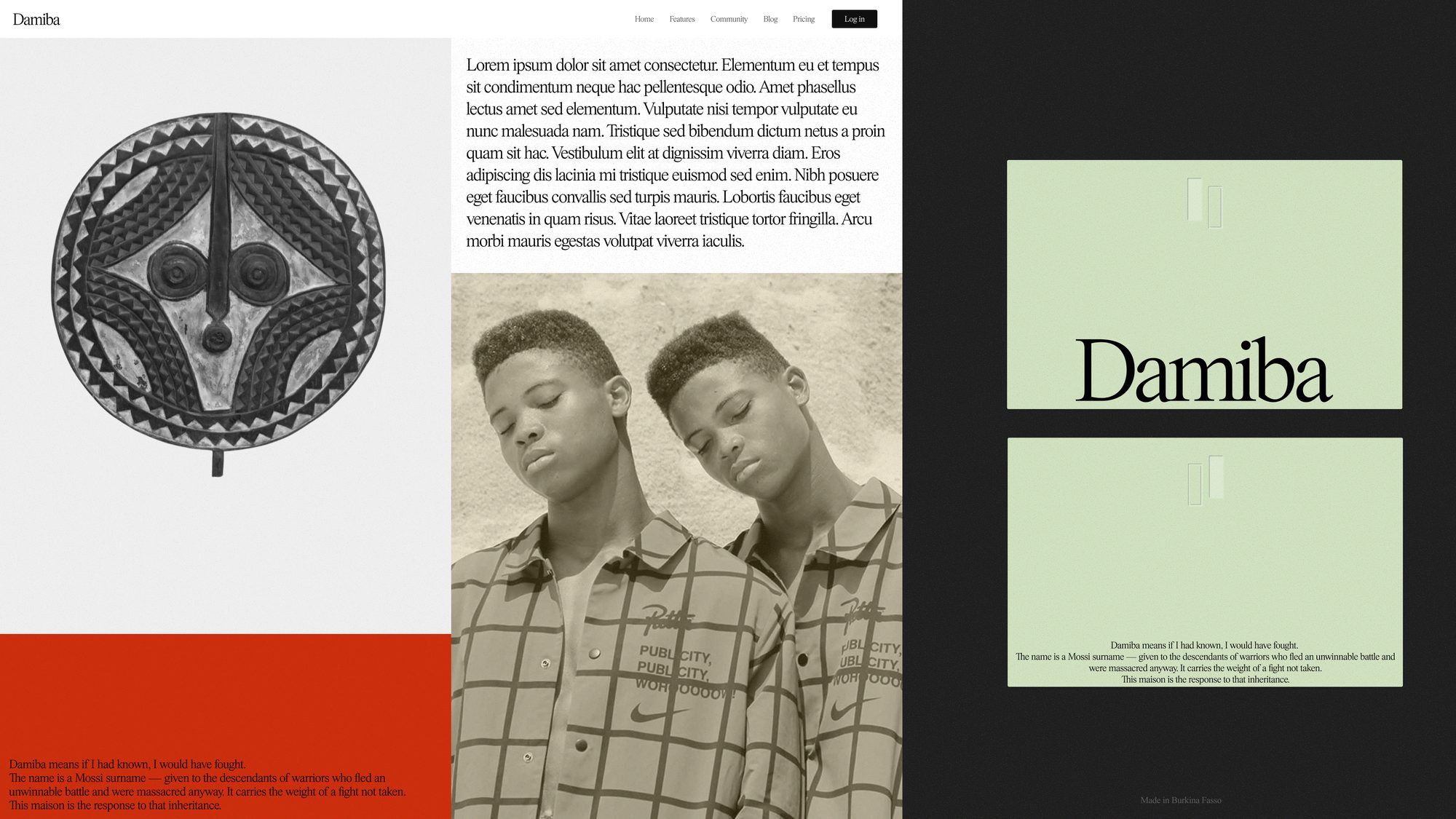
We started with the wordmark. The name already carried the weight. "Damiba" means "if I had known, I would have fought." The logo did not need to invent a story; it needed to give the existing one a form.
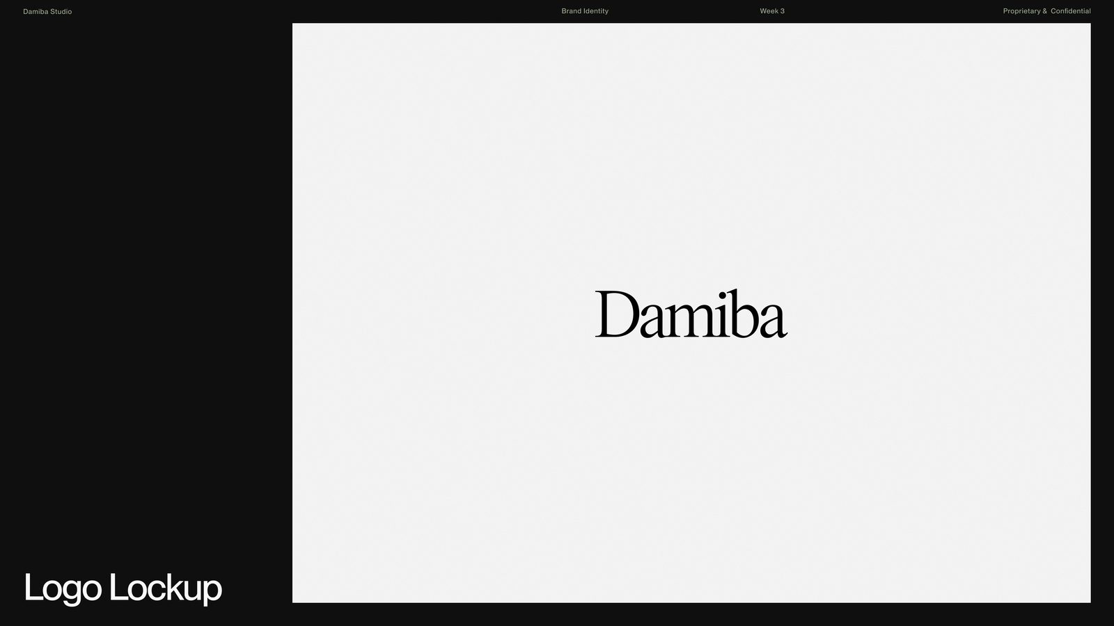
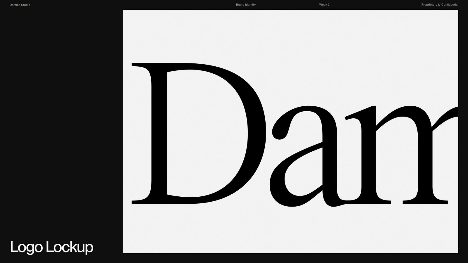
A good wordmark does not need to shout; it needs to hold. This one felt familiar and slightly strange at once. Institutional, but not passive. Classical, but not obedient.
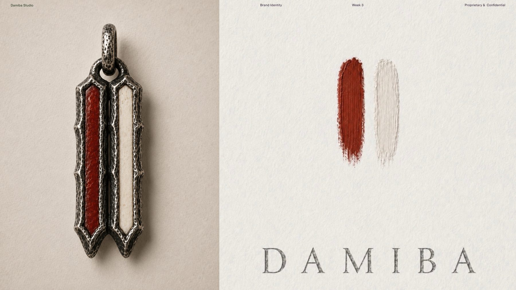
At the same time another idea kept reappearing: two vertical forms. Two strokes. Two adjacent elements. It showed up in the painted marks. It showed up in the pendant. It kept insisting on itself.
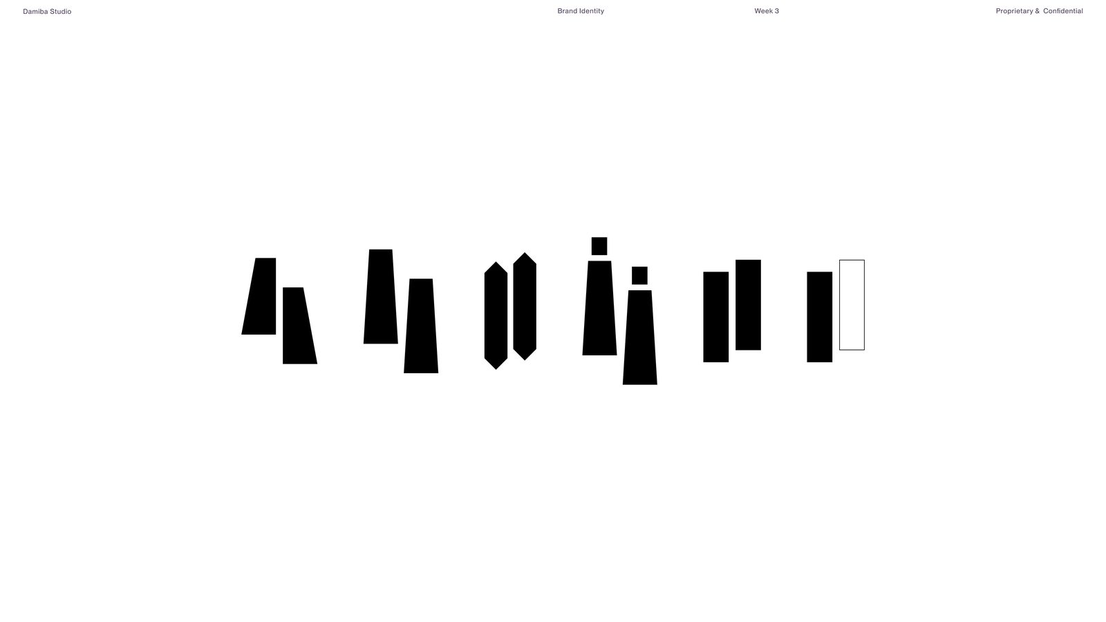
We explored more elaborate symbols first. Some felt too decorative. Some too much like an artifact. Some explained the idea too completely. Interesting, but the brand already had enough complexity.
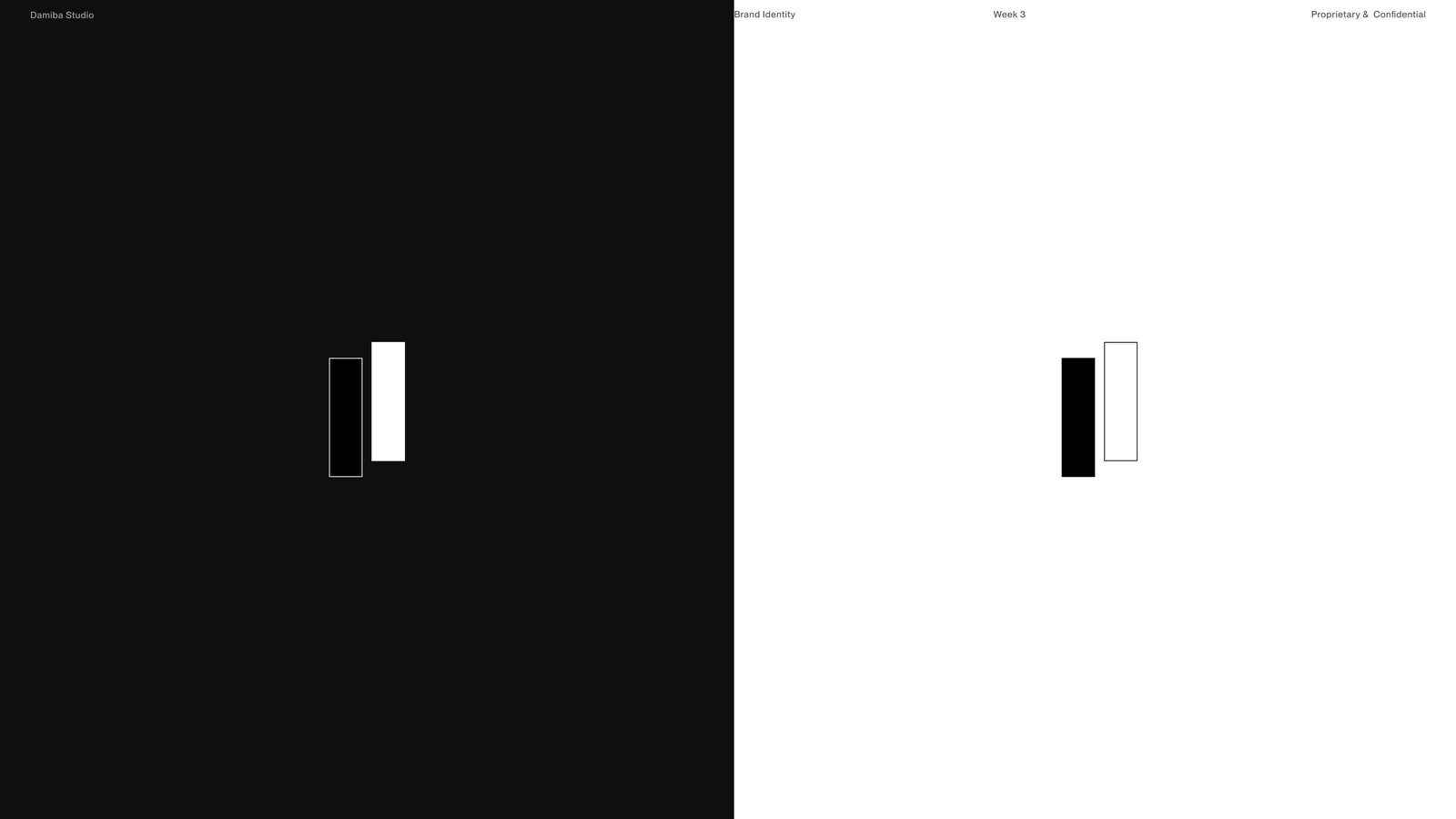
Two vertical forms, one filled, one outlined. The rest of the identity already carried the history. The symbol needed restraint.
What I like is that the mark does not force one reading. It can feel like strokes. Like pillars. Like twin forms. Like inheritance and response. It suggests instead of illustrating.
That simplicity made the system flexible. The wordmark can stand alone. The symbol can stand alone. Together they form the full lockup. That is when a logo becomes a system instead of a single graphic.
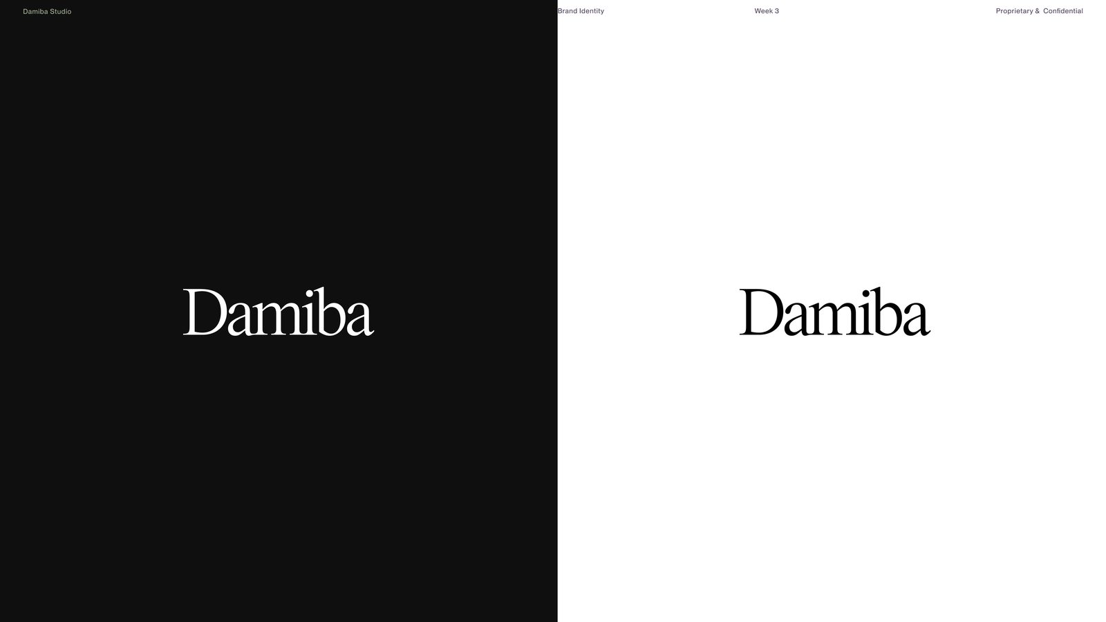
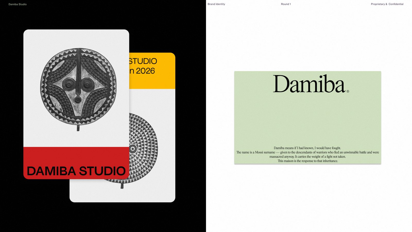
We also tested Damiba Studio as a secondary lockup for contexts where the full studio name matters. Same typographic world, different level of formality. The identity can expand without losing its center.